
Key Takeaways
- Technical analysis is a way to predict future price patterns by studying charts.
- Candlestick charts are incredibly useful tools that display a lot of information.
- There are various candlestick patterns to look for, that can signal a bullish or bearish trend.
- Identifying chart patterns can also help predict future price action.
- Remember that technical analysis can only give a possible indication of price trends, and you can not fully rely on it.
What is Technical Analysis?
Technical analysis is a method of analyzing and predicting price patterns, by studying trading data, such as past prices, trading volume, and indicators. Technical analysts do not attempt to measure a security's intrinsic value, but instead use charts and other tools to identify patterns that can suggest future activity.
Technical analysis is based on the idea that market trends can predict future activity. Certain patterns on charts may indicate buying or selling pressure, such as 'head and shoulders' or support and resistance levels (which we cover in the next lesson). Useful indicators, such as moving averages and relative strength index, can also help to determine the strength and direction of a trend.
While technical analysis can be useful in identifying potential trade opportunities, it is important to note that it is not a perfect science and can never predict the future with 100% accuracy. It is always critical to consider other factors, such as fundamental analysis and news events, when making trading decisions.
Reading Candlestick Charts
Most cryptocurrency trading charts look like the one below, and this is called a candlestick chart. They can look confusing if you don't understand how to read them, but once you learn about them, you can see how useful they are for finding patterns and predicting potential future price movement.

In some instances, for example if you type in 'Bitcoin price' into Google, you may see a line chart, like the one below. The chart below is for the exact same BTC/USDT trading pair and the same time period as the candlestick chart above. You can see that the price movements are the same, but once you learn how to read candlesticks, you will realize how much more meaningful the first chart is.

What is a Candlestick?
Each candlestick is a representation of the price movement within a given time period. You can change your charts to display one candlestick per minute, all the way up to one candlestick per month. For the explanation below, we will pretend that one candlestick represents 1 day.
There are two colours of candlesticks, green and red. Green candlesticks are bullish candlesticks, and they show that the price has increased during that time period. Red candlesticks are bearish, and they show that the price has decreased during that time period.
The candlesticks are divided into a wider section, called the real body, and thin lines, known as the wick or shadow. These are important as they show how the price has moved throughout that time period. Let's first look at a bullish (green) candlestick. The bottom of the real body is the open price, or the price that the coin was at the start of the day and the top of the real body is the close price - the price that the coin was at the end of the day. The top of the wick is the highest price it reached within that day, and the bottom of the wick marks the lowest price it reached.
For the bearish (red) candlestick, this time the top of the real body is the open price, because the price falls throughout the day, and the bottom of the real body marks the close price. The top of the upper wick is still the highest price it reached and the bottom of the lower wick is the lowest price.

Candlestick Patterns
Now that you know what a candlestick is, we can discuss candlestick patterns. Candlestick patterns are visual representations of price movements on a chart that can help traders identify potential buying and selling opportunities in the market. They are typically formed by the price action over a specific period of time, such as one day or one hour, and are often used in technical analysis to predict future price movements. Candlestick patterns can be bullish, indicating that the price is likely to rise, or bearish, indicating that the price is likely to fall.
We will cover some common candlestick patterns such as hammer, shooting star, and engulfing patterns. Each pattern has its own unique characteristics and can provide valuable insights into the market sentiment and potential trend reversals.
Hammer
The hammer candlestick pattern is named because it looks similar to a hammer (shown in the image below). It is a bullish reversal pattern that forms after a downtrend and indicates that the market may be shifting from bearish to bullish. It is characterized by a small real body (the area between the open and close prices) with a long lower wick and little or no upper wick. The long lower wick suggests that the market has tested lower prices but ultimately rejected them, leading to a bounce back towards higher prices, and closing the time period at the highest price.
The hammer pattern is considered a bullish signal because it indicates that the bulls (buyers) are taking control of the market and driving prices higher. However, it is important to note that the hammer pattern alone is not a definitive indicator of a trend reversal, and should be confirmed by other technical indicators or price action.

Shooting Star
A shooting star candlestick pattern is the opposite of a hammer pattern. It gets its name because it looks like a falling star (see image below). The shooting star is a bearish reversal pattern that may indicate a shift from a bullish to bearish market trend. It is formed by a small real body with a long upper wick and little or no lower wick. This pattern suggests that the market has tested higher prices but ultimately rejected them, leading to a decline in prices. While the shooting star pattern is generally seen as a bearish signal, it should be confirmed by other technical indicators or price action before making any trading decisions based on it.

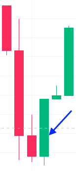
Bullish Engulfing
A bullish engulfing pattern consists of two candlesticks, and is evident when a bullish candlestick 'engulfs' the previous bearish candlestick, as seen in the screenshot below. The body of the bullish (green) candle covers the body of the entire bearish (red) candle. This shows a large reversal in price action, and is seen as a strong bullish signal since it indicates the the bulls have taken control of the market, pushing the prices higher.
Bearish Engulfing
A bearish engulfing candlestick is the opposite of a bullish engulfing candlestick. It is a candlestick pattern that is used to predict bearish trends in the market. As you can see in the screenshot below, the bearish (red) candle fully 'engulfs' the body of the bullish candle. This pattern is seen as a strong bearish signal because it indicates that the bears have taken control of the market and are pushing prices lower.

Three Black Crows
This candlestick pattern is a bearish signal, and is characterized by three consecutive long red candles, with small (or non-existent) wicks. It shows that a bearish trend is beginning, since sellers have overtaken buyers over three consecutive sessions.

Three White Soldiers
This pattern is the opposite to the three black crows, and signals a bullish trend, as an increase in buyers push the price higher. To spot this pattern, you need to find three long consecutive green candles with small wicks.

Morning Star
The morning star is so named because it gives hope in a bearish market, and signals a possible reversal. This pattern comprises three candlesticks - one short-bodied candle in between a long red and a long green candle. What this pattern shows is that the selling pressure is decreasing, and buyers are entering the market.

Evening Star
This candlestick pattern is the opposite of the morning star. It marks the possible end of a bullish trend, and signals that a bearish downturn is potentially on the horizon. The pattern consists of three candles: one short body candle sandwiched between a long green and long red candle. If the third candle is larger than the first candle, then this is an especially strong sign that the market is turning down.

Chart Patterns
Studying chart patterns are another way of predicting future price movements, and they can be used alongside candlestick patterns. They are a longer-term analysis of market movements compared to a candlestick pattern, but are still short term indicators, and are used frequently in swing trading and day trading. Let's look at some of the most commonly used chart patterns.
Double Top
A double top chart pattern is an extremely bearish reversal pattern, and is characterized by two peaks at approximately the same level, with a valley in between. This pattern signals that buyers have tried twice to push the price higher, but there is a resistance there, and sellers are gaining control of the market once it hits that price level. The 'neckline' is a support level (see dotted line below), and is the low point in between the two peaks. The bearish trend is confirmed once the price drops below the neckline after the second peak.

Double Bottom
The double bottom chart pattern is the opposite of the double top. This pattern is a strong bullish reversal pattern, and forms when the price of a cryptocurrency reaches a low point, bounces back, and then retests that low point before rising again. The pattern is characterized by two troughs at approximately the same level, with a peak in between them. It is considered a bullish signal because it indicates that the bulls (buyers) are gaining control of the market and driving prices higher after the asset has reached a support level. This pattern is often used to identify potential buying opportunities, as the price is likely to continue rising after the second trough is formed, particularly once the price passes the neckline.

Head and Shoulders
The head and shoulders is a bearish reversal pattern, and bears similarities to the double top. Instead of two peaks, there are three peaks, with a slightly larger peak in the middle. Just like the double top, there is a neckline, which is the support that is touched twice in between the peaks. Once the third peak breaches this level of support, it is a good indicator of a breakout into a bearish downward trend.

Ascending Triangle
Another useful chart pattern is the ascending triangle. As you can see below, there is a resistance level which stays at around the same price, but you can see the support level is gradually increasing. With each downswing in price, the low point is getting higher, and you see a formation of a triangle, showing that the prices are becoming more constricted. Buyers do not want to pay higher than the resistance level, and sellers are not accepting lower prices anymore, which is why you see the support level rising.
When you see this sort of narrowing of a range, and consolidation happening, you may see a breakout, as supply is reduced - fewer sellers are willing to sell at a low price, yet there are increasing numbers of buyers. You can see in the graph below, after it gets to a certain point (where the vertical dotted line is) the price breaks out of the triangle, and pushes higher.
Remember that when you see higher lows (where the bottom of the dips get progressively higher than the previous), or higher highs (where each peak is higher than the last), this is a bullish pattern.

Descending Triangle
The opposite of the ascending triangle, is of course the descending triangle. This is a bearish pattern, as the lower highs form a falling resistance line. For advanced traders, this is a good opportunity to enter a short position, in order to profit from a predicted fall in prices.
Descending triangles will usually break through the support level because it represents an oversupply of sellers. The consecutive lower peaks mean that buyers are unwilling to pay as high of a price for the cryptocurrency, and this trend is likely to continue.

Wedges
Wedges are seen when the cryptocurrency's price begin to constrict between sloping support and sloping resistance lines. In the example below, you can see both lines are sloping down, so this is called a 'falling wedge'. This is an indicator that the price could break through the level of resistance, and begin a bullish trend.

When the trend lines are sloping up, this is a 'rising wedge', as seen in the screenshot below. This is a good indication that the price may break through the level of support, beginning a bearish trend.

After this lesson, you should have a solid basic understanding of how to read candlestick charts, and how to identify some common candlestick patterns and chart patterns. Patterns can be used to predict the future, but remember that they are only an indicator, and are not definitive signals to trade. Patterns are also hard to spot, and may not occur often, so you need to spend time looking for them.
It is also important to remember that patterns are short term indicators, and do not work for predicting outcomes in the longer term. If you want to focus on trading in the long term, you need to learn about spotting trends, and using indicators, which are topics we cover in our next lesson.